Minimal home by AD Architecture challenges “box-like” urban development in China
Chinese studio AD Architecture has completed a mixed-use building in Shantou, Guangdong Province, which features a geometric facade and a minimalist family home.
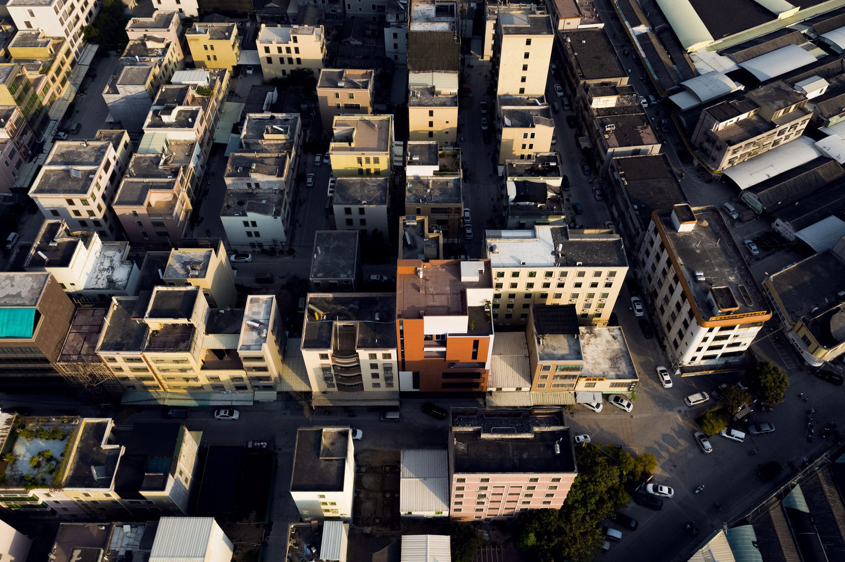
Called Red Box, the building in Xinxi Town is designed by AD Architecture to challenge the monotony it saw in new developments in China.
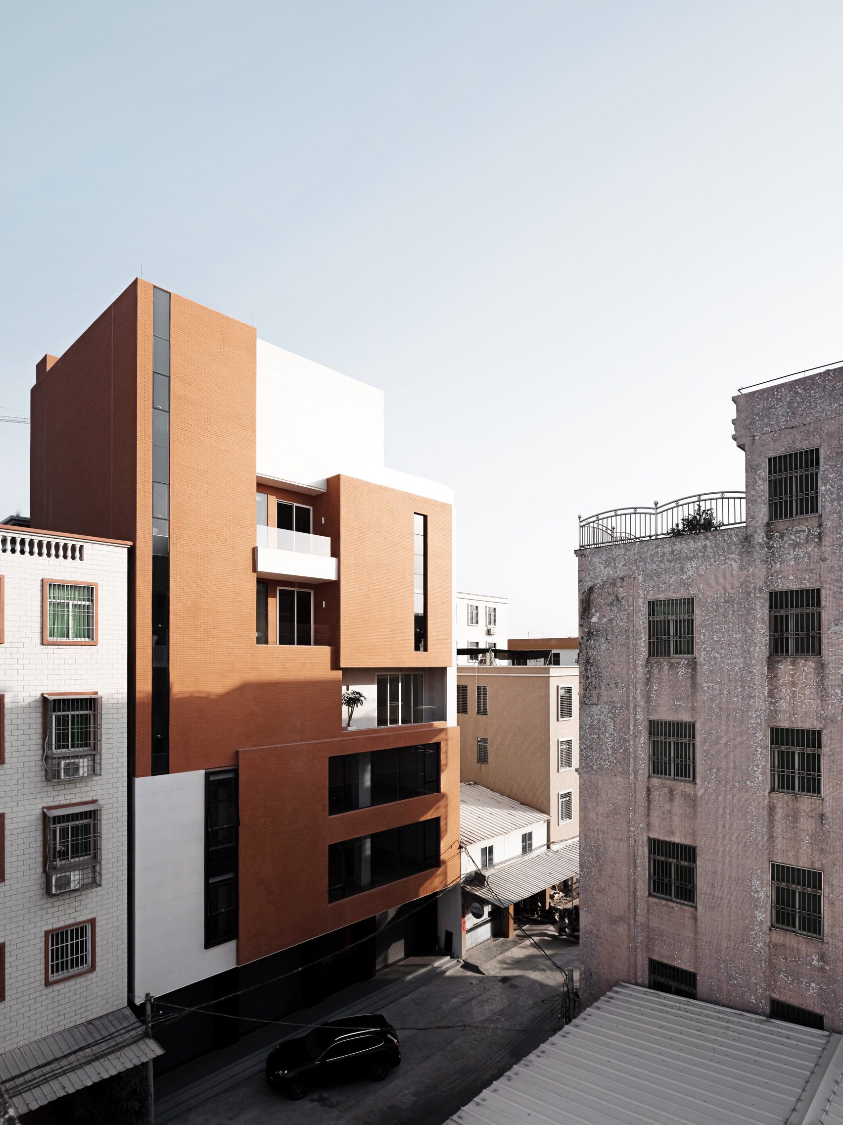
Breaking up its external form is a geometric facade composed of terraces and balconies, decorated with red bricks and matt-white tiles.
Inside, the 420-square-metre building contains a shop and commercial workshop spaces, alongside the minimalist two-storey dwelling.
“Many rural residents construct houses after their neighbours’, with no consideration of their personalised needs,” said the practice. “For this reason, unaesthetic and uniform ‘box-like’ buildings are sprawling.”
“[Red Box] forms a strong contrast with the surroundings, while conveying a sense of harmony and respect…white and red boxes with varying sizes and proportions are combined yet separated subtly, producing a modern exterior,” the firm added.
The arrangement of the six-storey Red Box was conceived as a series of interlocking units, with a ground-floor shop and four storeys of workshop spaces above.
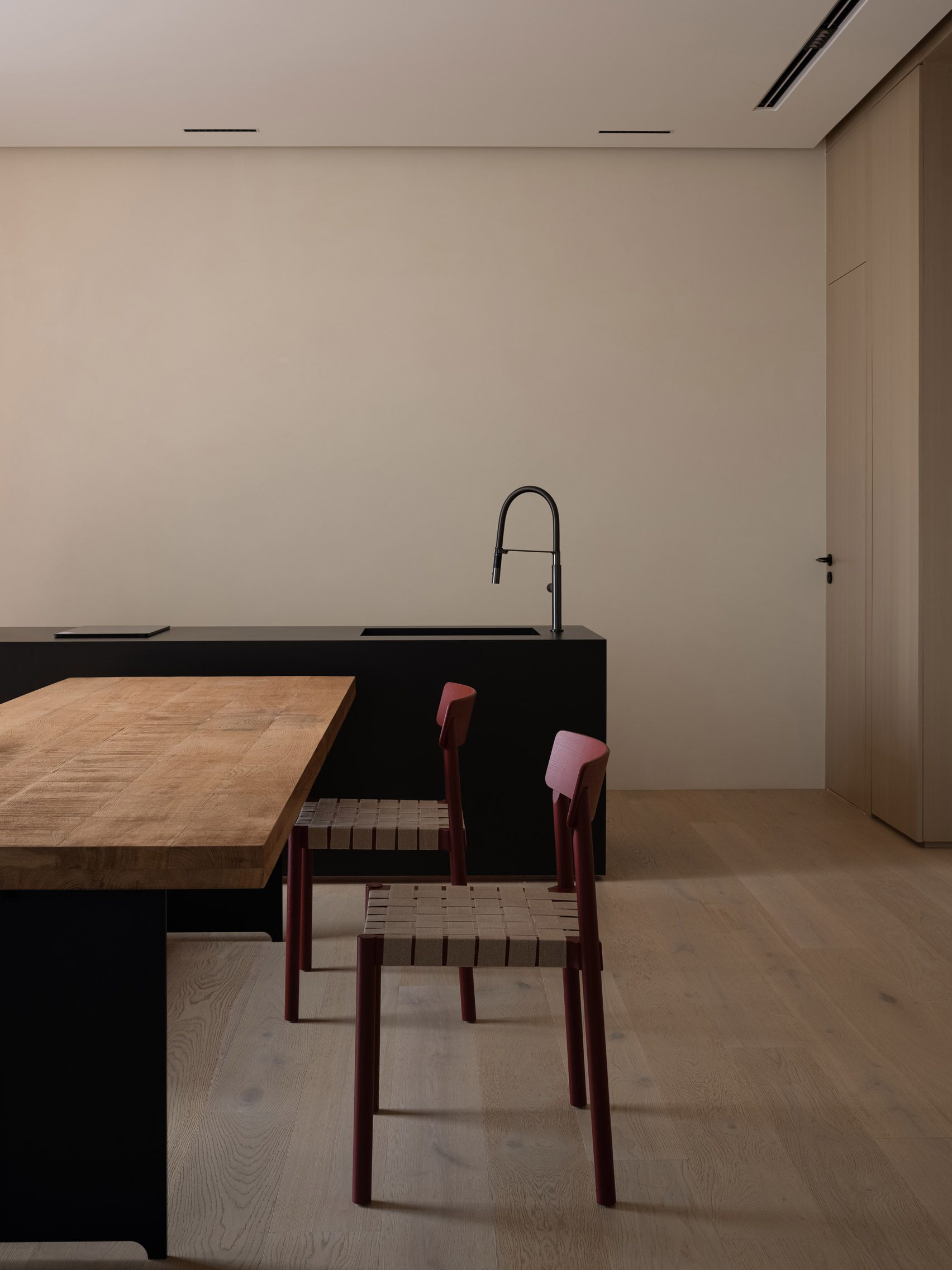
The fifth storey contains the main living spaces for the home. This includes two bedrooms and bathrooms arranged on either side of a kitchen, dining and living area that opens onto balconies looking out over the town.
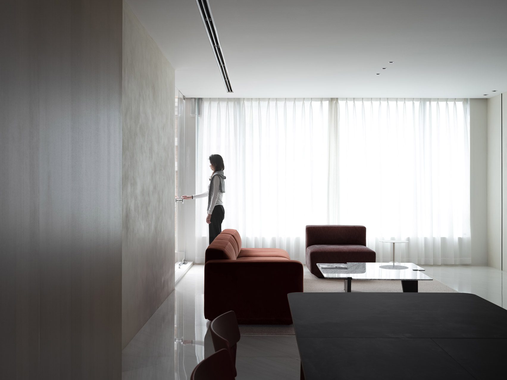
At the top of the building, the sixth storey is designed for entertaining guests. Here there is a second large living and dining space connected to a rooftop terrace, children’s playroom and guest bedroom.
The sides of the building that sit close to neighbouring structures are left blank, while the front facade features a mixture of thin vertical windows, horizontal openings and deeply recessed balconies.
Internally a simple palette of marble tiles with wooden veneers and built-in storage has been used, contrasted by red glass panels in the kitchen and red furniture that references the external brick cladding.
The living room and dining area feature marble floors, while the kitchen and family rooms are finished with a warmer palette of wood and white paint to bring a “sense of comfort”.
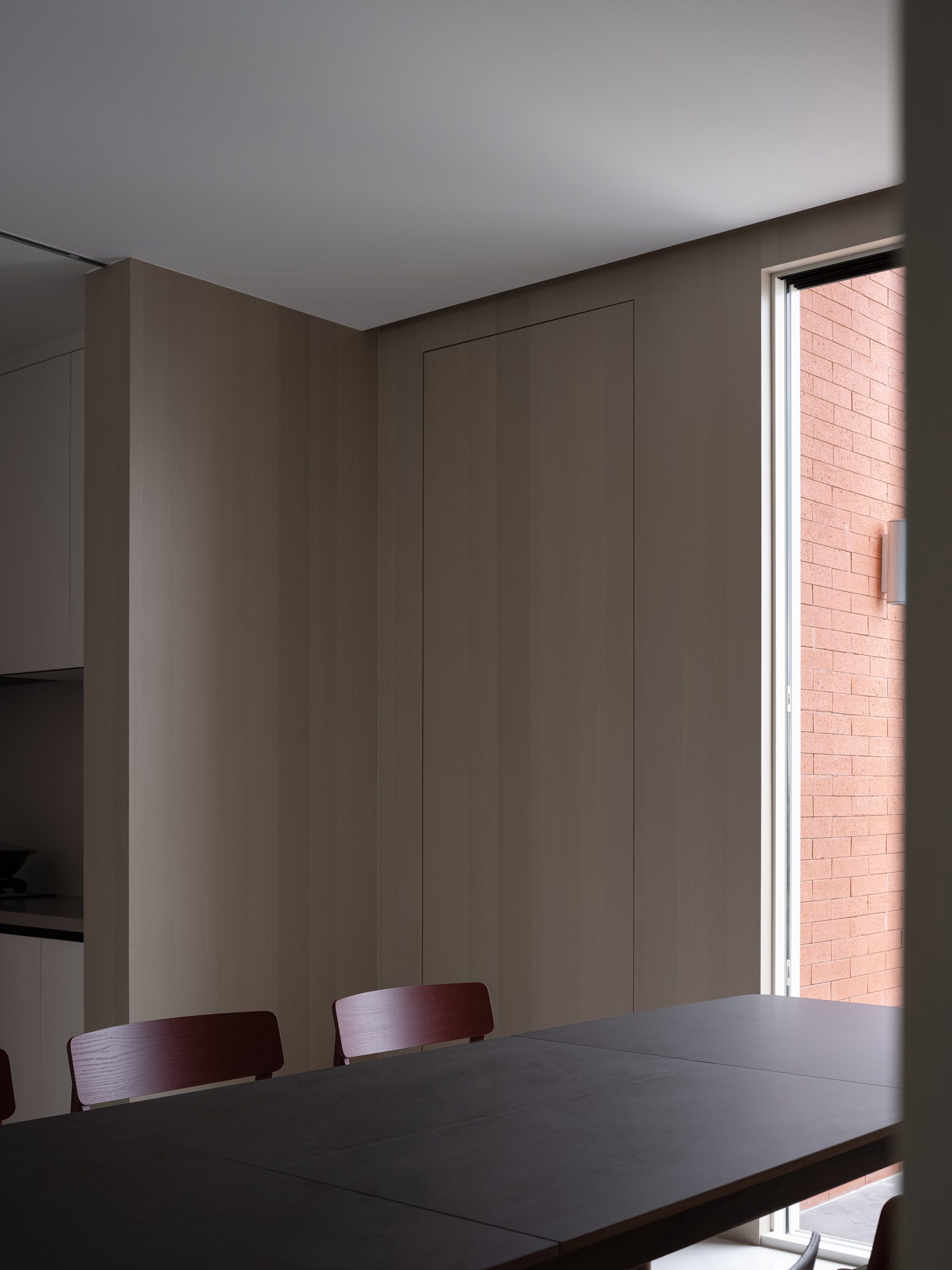
“The overall interior design of the residence emphasises simplicity and comfort,” said the practice. “The design may not represent a sea change, but it does make a difference to the residents’ lives.”
Another project to recently complete in Guangdong Province is a retrofit by O-office Architects that involved inserting a tea museum inside several old factory buildings near the city of Guangzhou.
The photography is by Ouyang Yun.
The post Minimal home by AD Architecture challenges “box-like” urban development in China appeared first on Dezeen.


